System Usability Scale
A 10-question survey that scores any product's usability from 0 to 100.
Measuring perceived usability and comparing versions.
A SUS score and grade per version.
Ten questions, one usability score
The System Usability Scale (SUS) was created by John Brooke at Digital Equipment Corporation in 1986 as a “quick and dirty” usability survey. It's now one of the most used measures of perceived usability in the world.
Users answer 10 statements on a 1–5 scale after trying a product. The result is a score from 0 to 100 that you can compare over time and against other products. The average is about 68.
How scoring works
Alternating statements
Convert each answer
Add and multiply
Interpret
SUS calculator
Answer as if you'd just used a product — or enter a participant's answers. Save several participants to get an average.
Measuring a redesign with SUS
A fictional payments app team redesigns its split-bill flow and uses SUS to measure the change.
Baseline test
Find out why
Redesign
Test again
Fictional example; scores are illustrative.
Common mistakes
✓ Do
- Give SUS right after people use the product
- Keep the standard wording (small tweaks like “website” for “system” are fine)
- Compare scores for the same tasks over time
- Pair it with observations and task success
- Report the average and the number of participants
✗ Avoid
- Reading the score as a percentage
- Changing or dropping statements
- Using it to find specific problems — it can't
- Comparing across very different tasks or products without context
- Calculating item averages instead of per-person scores first
SUS in one screen
10 STATEMENTS, answered 1 (strongly disagree) – 5 (strongly agree)
odd = positive · even = negative

SCORING (per participant)
  odd items:  answer − 1
  even items: 5 − answer
  SUS = (sum of 10 items) × 2.5        → 0 to 100

INTERPRET
  68 ≈ average · 80.8+ = A · 71–80 = B/C+ · below 51.7 = F
  not a percentage; percentile-like

USE  after tasks · same tasks when comparing · pair with observations
Figma template
A ready-made canvas for running this framework with your team. Free, editable, and it works in Figma and FigJam.
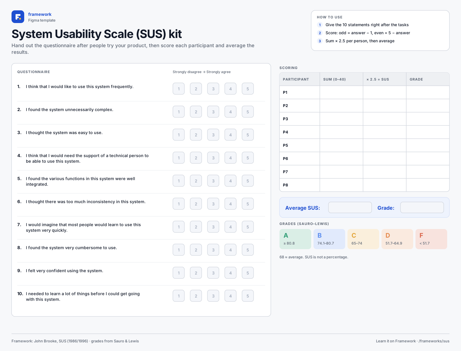
System Usability Scale kit
- 10-item questionnaire
- Scoring table
- Grade scale
- 1Download the SVG, or copy it to your clipboard.
- 2In Figma or FigJam, drag the file onto the canvas — or paste with ⌘V / Ctrl V.
- 3Everything arrives as editable layers: type in the boxes, add stickies, duplicate rows.
Quick quiz
Get all three right to complete the lesson.
Notes are private and stored in this browser.
Sources and further reading
- John Brooke — SUS: A quick and dirty usability scale (1996)
- MeasuringU — Measuring Usability with the System Usability Scale
- Sauro & Lewis — Quantifying the User Experience (2016)
Related frameworks
Kano Model
Basic needs, performance features and delighters: know which features to build first.