Laws of UX
Psychology principles like Hick's, Fitts's and Jakob's Law, applied to UI.
Explaining design decisions and fixing interaction details.
Design decisions backed by named principles.
Psychology you can design with
Laws of UX is a collection of psychology principles gathered by designer Jon Yablonski on lawsofux.com and in his book Laws of UX (O'Reilly, 2020). Each explains something about how people perceive, decide and remember — and what it means for interface design.
They aren't strict laws of nature. They're well-researched tendencies that help you explain and defend design decisions.
12 laws every designer should know
Jakob's Law
Fitts's Law
Hick's Law
Miller's Law
Goal-Gradient Effect
Peak-End Rule
Von Restorff Effect
Doherty Threshold
Tesler's Law
Zeigarnik Effect
Aesthetic-Usability Effect
Law of Proximity
Fitts's Law test
Click the targets as fast as you can: 5 small ones, then 5 big ones. Compare your average time.
The test area. Small targets appear anywhere; big ones near the centre.
Hick's Law test
Find the fruit shown and click it. 5 rounds with 4 options, then 5 rounds with 16.
Options will appear here.
A checkout, law by law
Most good mobile checkouts use several laws at once.
Familiar layout
Progress you can see
Fewer choices first
Chunked input, big button
A good ending
Fictional shop for teaching.
Common mistakes
✓ Do
- Use laws to explain and justify decisions
- Combine laws with real user testing
- Break a pattern only when it's clearly better (Jakob's Law)
- Highlight one thing at a time (Von Restorff)
- Make feedback instant, even if the work isn't
✗ Avoid
- Treating them as strict rules that always apply
- Quoting “7±2” to limit menus to 7 items (that's not what Miller meant)
- Making everything stand out
- Using the Zeigarnik effect to nag people
- Believing aesthetics can hide real usability problems
Laws of UX in one screen
JAKOB'S          work like other products people use
FITTS'S          bigger + closer = faster to hit
HICK'S           more choices = slower decisions
MILLER'S         chunk information (≈7±2 in working memory)
GOAL-GRADIENT    effort rises near the goal → show progress
PEAK-END         design the best moment and the ending
VON RESTORFF     the different thing gets noticed
DOHERTY          respond within ~400 ms
TESLER'S         complexity moves; make the system carry it
ZEIGARNIK        unfinished tasks stick in memory
AESTHETIC-USABILITY  beautiful feels easier
PROXIMITY        close = related
Figma template
A ready-made canvas for running this framework with your team. Free, editable, and it works in Figma and FigJam.
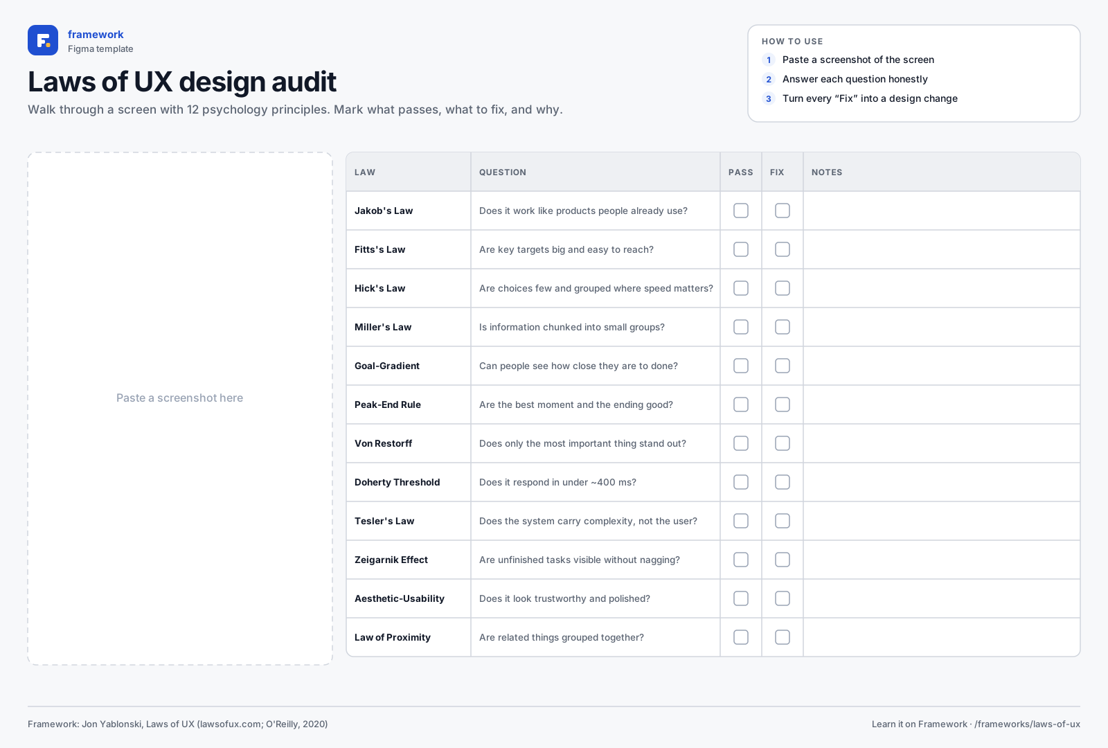
Laws of UX design audit
- Screenshot area
- 12-law checklist
- Pass / fix notes
- 1Download the SVG, or copy it to your clipboard.
- 2In Figma or FigJam, drag the file onto the canvas — or paste with ⌘V / Ctrl V.
- 3Everything arrives as editable layers: type in the boxes, add stickies, duplicate rows.
Quick quiz
Get all three right to complete the lesson.
Notes are private and stored in this browser.
Sources and further reading
- Jon Yablonski — Laws of UX
- Jon Yablonski — Laws of UX (O'Reilly, 2020)
Related frameworks
System Usability Scale
A 10-question survey that scores any product's usability from 0 to 100.